
One of the goals of the old fashioned look was to separate the brand from industrial processes and bring childhood memories to their main target audience (people older than 40).
The logo is a stylization of the shape of the cacao fuit; the selected typeface elicits the creaminess of chocolate.
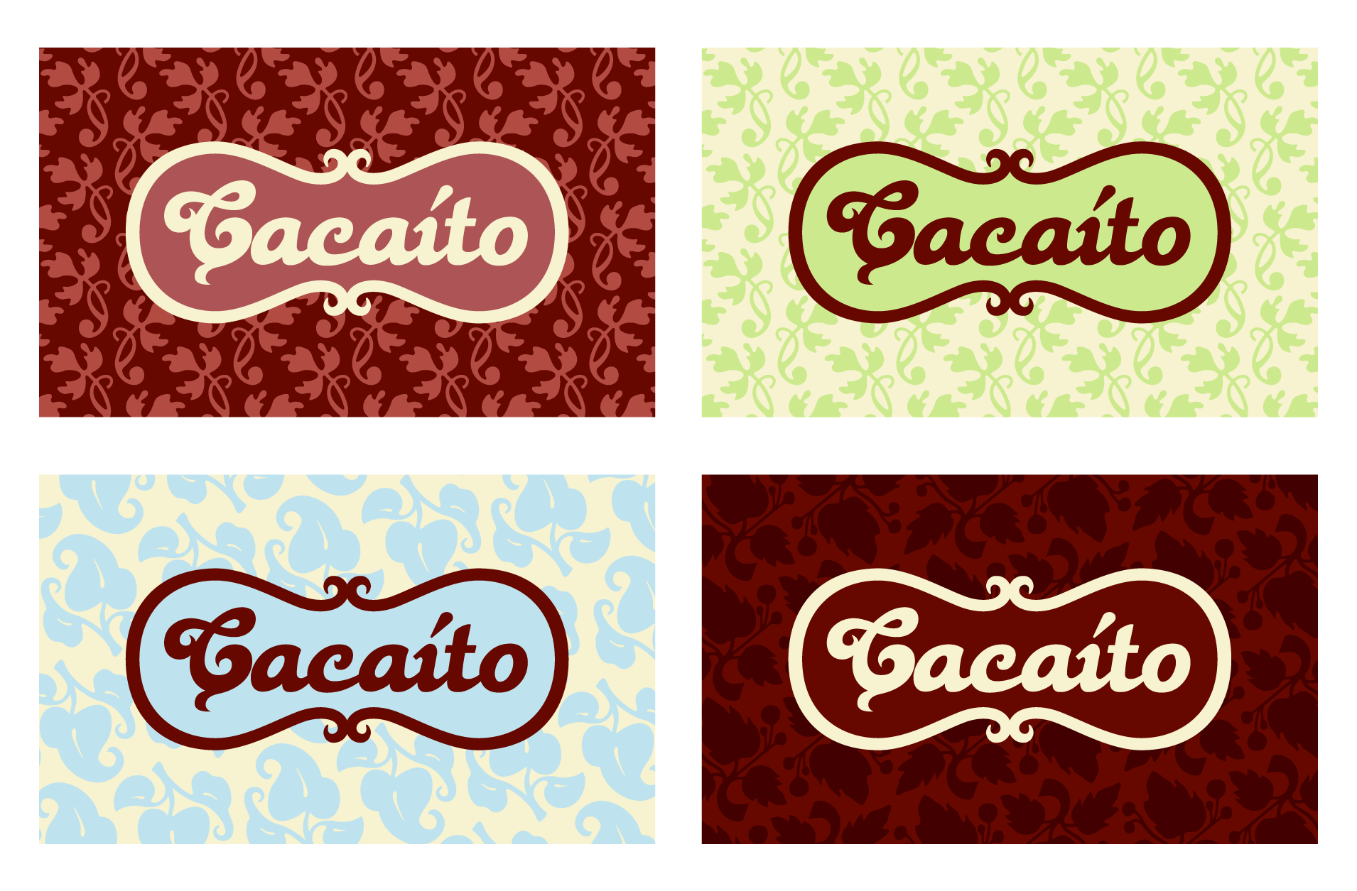
Additional assets like old fashioned looking patterns and different color palettes, bring support to the branding language and are used specially on packaging to differentiate chocolate types and flavors.